CONSTRUCTED LANDSCAPES
|
'all the visible features of an area of land, often considered in terms of their aesthetic appeal.'
'the soft colours of the Northumbrian landscape' In photographic terms a 'Landscape' is when the framing of the picture is wider than it is long. Here are some pictures I found of landscapes through Google, most of them look to have some form of editing done to them shown through their bright and saturated colours and their surrealism however i find the the composition of a lot of them to be very similar to one and another perhaps because they are mainly of mountainous and alpine scene with the vanishing points being somewhat varied amongst photographs
|

an example of a landscape photograph I took
|


images from google
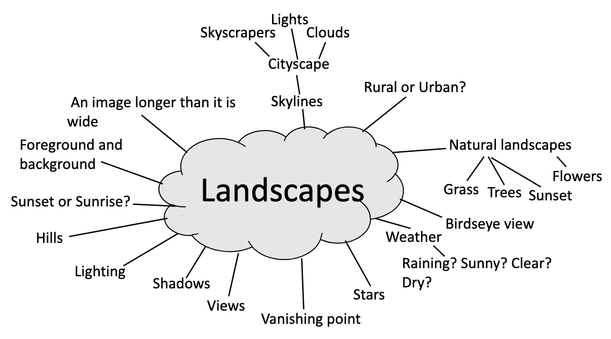
MINDMAP
MOOD BOARD
'A mood board is a type of visual presentation or 'collage' consisting of images, text, and samples of objects in a composition.'
|
|
|


HELENE BINET
Helene Binet is a London-based Photographer who produces greyscale images in which the main subjects of the images are unable to be pinpointed however are recognisable to a degree creating a sense of confusion and nostalgia, this could be due to the abstract architectural design in which Binet integrates into her work which consists of already existing structures and materials however are manipulated into these conceptual and obscure pieces of architecture.


|
This is my favourite piece of work out of the six photographs I selected by Helene Binet, I really like the depth presented in this piece of work as there is a clear vanishing point in which directs the eye, it is also difficult to make out what the subject of the image involves outside of the fact that it is a building due to the angle in which the picture is taken in which distorts the appearance of both the building's shape and overall structure. I think Binet may have done this to create a piece of work in which is not predominantly based on the building but perhaps using the building to create lines, edges and contrasting shades of greyscale colours to act as components for the construction of the piece as a whole; a cloudy sky resting above the intricate and warped architectural design of building.
|
DAFNA TALMOR
Dafna Talmor is a London based visual artist, the photographs produced by her appear to be using the negative space 'Negative space, in art, is the space around and between the subject of an image'. as the main focus of her art almost like an inversion of a traditional photograph using positive space as a foreground rather than a background. Objects like tree branches and leaves are layered over the primary space which is used as a background in this case. The colours used are natural colours such as greens, browns and oranges and blues which are the colours usually found in a regular landscape and appear to have been taken from that and used in a unique way as apart of a negative space background. I like these images because they make you view them in a different way you would in a regular landscape photograph due to it's inversion of positives and negative, it also takes aspects from a rural landscapes and implements them in the background.


|
This image consists of trees, what appears to be a forest and a mountain. I find this image interesting because it implements the natural tones and colours found in a traditional rural landscape photograph however they have been twisted and altered in a way where the contents of the original photograph are recognisable but hidden at the same time creating an uncanny and disorientating effect. Another thing I noticed in this photograph is the inverting of the positive and negative space, for example the dark shaded trees are used as positive spaced foreground with both the forest and mountain being used as a negative spaced background. I also find interest in the contrast between both background and foreground in terms of colour as the black trees and bushes contrast over the lightly muted colour forest and mountain.
|
CORRINE VIONNET
Corrine Vionnet is a visual artist based in Vevey, Switzerland, her work consists of photographs of famous landscapes with a distorted blur effect, the colours appear to be dimmed down more to what they would normally be which creates an abnormal mood. I like how the photographs are familiar as the blur effect applied in the photograph makes it appear unusual and recognisable at the same time as the photographs taken are of famous landscapes. The photographs remind me of an oil painting because of the tones, colours and how they blend into eachother in the photograph. I also appreciate how some aspects of the photograph are somewhat unrecognisable and adds a sense of emptiness in some of the photographs, for example, in the photograph of Big Ben the clock hands and the details on the main part of the clock are blended in and not visible which also amplifies this theme of familiarity and oddness.


|
This is my favourite photograph out of Corrine Vionnet's work. I chose this image because it reminded me of someone driving past in a car and taking a blurry picture. I find it somewhat gloomy and saddening because of the muted colours and undefined edges as if it is a shadow of what it traditionally is. This photograph also reminded me of an oil painting due to it's muted and neutral tones, misty edges and leachy colours almost as if they were dripping down the page like wet paint. This photograph also has a significant displacement and eeriness due to it being a common landmark known by everyone in London it holds a detectability to it and when complimented with a blurry effect and muted colours it can appear uncanny and odd.
|
CHARLES WILKIN
Charles Wilkin is a New York based artist who produces a variety of visually challenging pieces using photographs and layered pieces of coloured cloth and material. The multi-coloured shapes of cloth within these photographs contrasts with their dull and less colourful backgrounds; they are carefully placed in a composition to flow and blend in with the backgrounds features and lines. I like how the variety of coloured patterned cloth and sheets of material contain shadow and depth making it appear as if it is falling out of the photograph almost like that of a flowing liquid. The background photographs, mostly black and white are of people and landscapes both natural and rural in which act as templates for the overlying foreground of the cloth layered over the top of the photographs in which create most of Wilkin's pieces.


|
This is my favourite piece out of the six Charles Wilkin's pieces I chose because I like how the greyscale and unadorned background featuring a woman looking forward perpendicular to the camera compliments the multicoloured pieces of cloths, fabrics and other various materials as they are positioned in a way in which follow the lines from the background image which act almost as a guide for the pieces of cloth to follow surrounding the shape of the woman's head in the background.
|
MAKING DAY EVALUATION
Today we was given a whole day to create practical pieces of work, I wasn't sure where to start or what I was planning to make so I started with a dark background which could act as a guide for layering photographs and started thinking about the theme and what type of images I would be cutting out. Once I had all the images cut out following a theme of variety, colour and oddness, I started thinking about where I was going to place them within my selected composition, I then proceeded to cut holes in the background and stuck images underneath to add some smaller layering details, I then continued this with another piece which I was a lot happier with.
I then uploaded my collage to photoshop where I layered both of the collages I created on top of each other with the overlying collage having a lower opacity in which allows the background to be visible through the collage layered over the top.

|
I like how this piece turned out to a degree, I find that the way I implemented both pieces to create the final one worked well with lots of details and colours being visible throughout the various layers in which contrasts towards the black background, I find with this piece that the longer you look at it the more components included become apparent which I really appreciate. I am also content with the types of images I decided to use within the piece e.g the various types of patterned circles and shapes I used to create both texture and depth within both collages such as the leopard print. I think I could have improved this piece by simply taking more time cutting out the circles and other outlining shapes however as I feel that would improve the overall both appearance and presentation of the piece in general
|
AWOISKA VAN DER MOLEN
Awoiska van der Molen is a Dutch Photographer who lives in Amsterdam, her work consists of rural landscapes with muted black and white tones giving them a feeling of emptiness or silence. All the photographs below are apart of her project titled 'Silent Landscapes', which closely matches the photographs themselves and their eery and quiet shades rather than a saturated and lively piece. I think she chose to use rural landscapes rather than urban landscapes because she can contradict a rural landscape a lot more with, black and white tones than she could with an urban landscape because I feel that urban landscapes already include a range of grey dark and somewhat jejune colours. A lot of the subjects in the photographs are bushes and, leaves and the edges and outlines are undistinguishable due to how close up she has taken them, I think she has done this so it adds a sort of puzzle and mystery to the photographs making people look at them longer and wonder.


|
This image is my favourite out of the 6 of Awoiska van der Molen's I selected because it reminded me of a photograph produced by Dafna Talmor (bottom image), for example I found similarities between the two photographs in terms of positive and negative space and how the foreground is a black overlay and main focus with the background being used to compliment the foreground. I also found similarities in the leaves as they are the main subject in both photographs and reflect the rural landscape, both images are also taken in very similar locations, both appearing to be a forest, I think they both decided to use these type of locations when creating these images because they both have a large wide shot landscape paired with overlapping leaves and tree branches which contrast over the open landscape. One difference between the two photographs however is that Awoiska van der Molen's is greyscale whilst Dafna Talmor's is coloured.
|
DISTORTED IMAGES
'giving a misleading or false account or impression; misrepresented.'


Today I took over 15 landscape photographs around school, I enjoyed this project because it made me search for far wide spread landscapes across the school which left me somewhat limited so I decided to try to take as many photographs in school of subjects outside of school such as Kidbrooke Village, buses and graffiti whilst staying within the boundaries of landscapes.
|
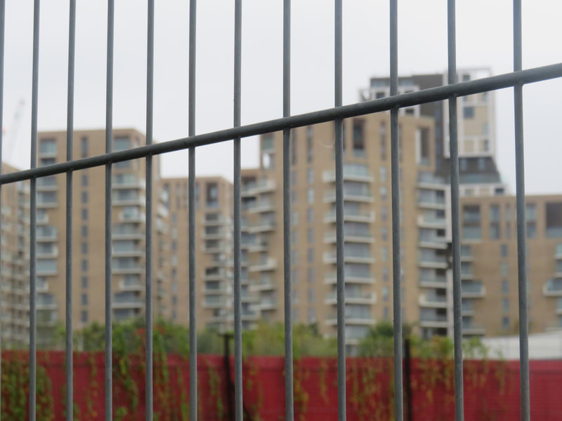
This image is my favourite out of all the ones I took today because I like how the camera is focused on the metal fencing with the buildings in the background being blurred. I also like how the composition includes the metal fencing foreground, the buildings being used as background and the middle ground being the red fence with overgrown leaves. I think they all go together and compliment each other in terms of composition and overall structure in this image. Another aspect of this photograph I like is how the background and foreground are not parallel with each other as the metal fencing is not in line with the buildings, I think this adds a lot to the image as it shows some form of contrast between the background, middle ground and itself.
|
I decided to make a collage out of the photographs I took in school last week, I like how it turned out and I think the arrangement made the collage look interesting to look at. I started with deciding to stick two coloured line patterned images to a black piece of card leaving a rectangle of the black background left in two corners, I then chose a range of the photographs I had took and layered them in the most appealing way I could think of whilst still trying to refrain from altering the borders of the photographs as my aim was to display the photographs I took whilst keeping the quadrilateral shape of the collage

Overall I am very happy with how this collage turned out for example, I like how the colours of all the images used in the collage are relatively similar due to them all being taken in the same area, this creates the effect that they blend into each other despite the very straight and quadrilateral shapes of the photographs in which are layered over each other, I think this choice of shape for my photographs creates a nice contrast between each one and allows for the photographs I took to be displayed well with little interruption from other images. I am also very content with my inclusion of the multicoloured striped paper I added as a background for my images, I think it creates an almost scrapbook feel to the collage which compliments the theme of the photographs being displayed as they are with no other manipulation.
LANDSCAPES IN THE CITY
I took a set of 18 landscape photographs over the weekend as apart of my independent learning. I took them in Central London at the Leadenhall Building because I found that the photographs taken from an up-facing angle towards a tall building creates a feeling of depth and distance and can amplify the height of the building itself creating a feeling of endlessness and immensity. I also liked how the buildings in the surrounding area are made of glass because they show the reflection of other buildings and create a sort of prism-like effect in the glass as though it is two photographs being taken in one with different subjects being involved.


|
I really like this image I took because of the saturated colours, reflection in the glass of the building and the brightness and shadow from the sun. I enjoy how the main focus of the image is in the reflection of another building rather than a straight forward photograph as it shows off the main focus in the image in an interesting way than the traditional landscape photograph. The camera is slightly upturned and it creates a geometric effect against the glass. I am also really keen on how the blue sky in the photograph reflects against the reflection of the glass. The colours found in the image consist of blues, greens and browns which compliment each other nicely. I believe I chose a really good time to take this photograph because the sun really amplifies the saturation of the leaves and the blue in the sky reflects against the glass building to compliment the main focus of the image.
|
YEAR 11 ASSESSMENT
|
During the making day I decided to incorporate Awoiska van der Molen's work into my piece, I decided to print off some photographs I took at the Leadenhall building in Central London and some of Awoiska van der Molen's greyscale images. I cut out the positive space within my photographs and placed them over the black and white landscape photographs, I found that i could create an interesting contrast between both the foreground and background with the background complimenting and creating a feeling of depth throughout the image. I experimented with a lot of my photographs against multiple different backgrounds and settings however I found one image (shown below) that I really liked the look of and wanted to experiment further with throughout the rest of the day. |
|


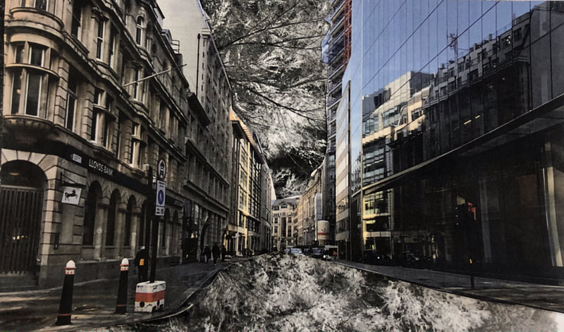
I chose to further experiment with this image in particular because i like how the photograph of the street has a clear centered vanishing point, I think this works well with the greyscale background I used from Awoiska van der Molen as it gives the effect that the background is almost consuming the foreground in a way as the vanishing point heads towards the flat and shallow background or as if a river is flowing in replacement of the road. Although I appreciated how this image looked i felt it lacked colour and could be seen as boring and dull so I decided to take inspiration from various different pop art images.
'Pop art is an art movement that emerged in the 1950s and flourished in the 1960s in America and Britain, drawing inspiration from sources in popular and commercial culture.'

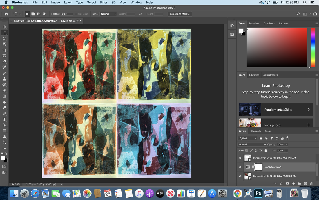
I decided to take inspiration from this art style as I wanted to experiment with various different colours and found that i could not choose between a lot of the different colours I overlayed on top of the images I also thought that if I included all 4 of the colours i used it could create an interesting dynamic between each one of the images as I chose to use only colours that contrasted with eachother. Firstly I started by adding my preferred image which I wanted to further experiment with into Adobe Photoshop, I then added a watery effect over the top to add more texture and detail to my image. Once i had the effect in the place I wanted it I then experimented with the different hues of both the ripple effect and the image, I chose four different colours which would go in each corner of an image to create a square and made sure the ripple effect which was overlayed would contrast with the underlying image in terms of colour, e.g. red and blue or purple and green. Once i had all four of the images exported I then used photoshop again to place all four of the images together to create a piece with different colours with inspiration taken from a 80s pop art style of image.


|
|

|


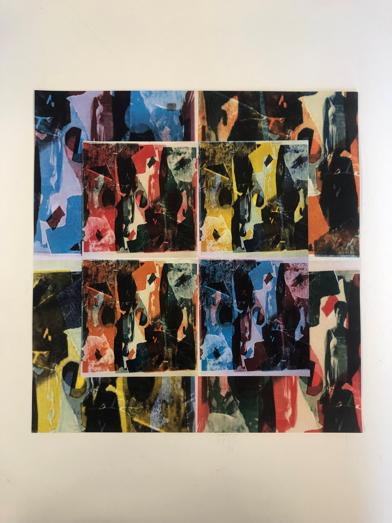
I was very content with this piece and I really liked how all of the colours compliment eachother and that I had incorporated Awoiska van der Molen's images into my own to make something completely new, however i had a lot more time to spare so with this time I decided to make use of the four different coloured versions of the image so I decided to print them off. After I had printed off the images I took inspiration from the pop art image of the Mona Lisa shown to the right so I decided to cut the images into strips of four, I then mixed all 16 strips of the images I had cut to make four completely different images, I really liked how the strips linked together however the different colours acted as barriers or lines separating each one of the strips which indicated that they were different images however connected at the same time through the fact that they are still the sane photograph.


|


|
JACQUI KENNY


Jacqui Kenny or more well known as The Agoraphobic Traveller uses google maps to create compositions of images of subjects such as, houses, cars and other colourful images in desert and sandy areas from Arizona in the US to Kyrgyzstan in Central Asia, I find Jacqui Kenny's images interesting because all of the subjects in the images are bright, and pastel colours which contrasts against the surrounding sandy landscape. All of the images seem to have their main subjects compositioned in the centre of the image and create an out of place and misfit effect with bright and light-hearted colours. I'd like to take inspiration from these photographs when creating pieces in the future and look for things more peculiar and out of place, I could also take inspiration from Jacqui Kenny's images in terms of how I take my images and maybe even considering using Google Maps to find out of place subjects in their surrounding landscape.

|
I like this image in particular because I find it interesting how the colours shown in the background on the houses are parallel to the colours shown on the car, the car is placed in the center of the image whilst being complimented by the background. I find that it almost appears to be something from a movie set due to the houses which almost look like props linking back to the idea of being out of place and eccentric compared to the surrounding desert landscape. I also found it interesting how the colours used in this photograph are slightly different to the colours Kenny usually photographs as they are far more saturated and full which I think contrasts the sandy and softer colours such as light blue and greyish yellow found in the sky and ground.
|
EXPERIMENTATION TOWARDS FINAL PIECE
I wanted to use water and light as a subject for a piece of work because I find that water and light compliment each other well due to the reflection and ripples that it gives against the wall and surrounding areas. I decided to fill a glass bottle with various items found both from outside and inside and placed them in a composition within the glass to create an almost aquarium like appearance, I then used a projector to project the light against water to produce a ripple effect against the background which I think added an interesting detail to the photograph.


Overall I like how the photographs look however I think the photographs could have been taken closer to the bottle to create are more indistinguishable appearance to the image, I would also use less recognisable items to place in the bottle as I think it would create are more uncanny and intriguing appearance to the photograph.
COLLABORATIVE COLLAGE
In lesson today we followed a set of instructions involving 3-4 photographs where we cut and swapped photographs with our partners, I came out with a selection of 4 collages in which i printed off which i could use as inspiration for my final piece.


|
Out of all 4 of the collages i came out with in the collaborative task this one is my favourite, I like how the photograph on the left of the man standing in front of the landscape layers over the top of the others. The tears made on the photographs make the photographs look old and naturally aged. I also like how some of the photographs have straight and untouched edges and some have teared edges which I think creates variation so not all the photographs look the same. I would take inspiration from this photograph when making other collages in the future so my collages look more naturally made and less manual.
|

|
I decided to use one of my collages I made during the collaborative task to create something more vibrant and colourful. I chose both pink and green to use when creating the collage because the 2 colours contrast with each other and are quite bright compared to the original image which is green blue and black. I would take inspiration from this process of making coloured collages with my own photographs and could also take inspiration from the pop-art style I used during the making day piece.
I noticed that after I added colour to my collage using the printer the collage became mirror and with opposite colours being on each side. What I would do next time when using this process is make sure that I keep the collage the same way round so it doesn't get mirrored, although the mirrored effect does look abstract and interesting, I think I would rather have the entirety of my collage displayed across the page. |
I decided to scan in my collage which I had coloured through the printer and use Adobe Photoshop to create a piece inspired by the Pop-art style of image I had used in my previous piece, I started by placing the same collage into each corner of the canvas and experimented with the hues and various shades I had available, The colours I chose were not completely desaturated however carried a tone often found in quite dated and vintage photographs which I found appealing.
I decided to print the collage out. Overall I really like how this piece turned out because I think the background colours used create an almost aged and vintage effect as they are not overly saturated or bright and are easy on the eye. I also really like how the black in the photograph contrasts against the white and coloured sections of the collage as this creates a nice repeating pattern throughout the collage. I am also very content with how my collage has some form of depth as I have layered it over itself with the contrasting colours being positioned together to create an alternating pattern of colour.
LORENZO VITTURI


I decided to take inspiration from Lorenzo Vitturi's work because I like how he uses both natural and peculiar objects against mainly dark and neutral backgrounds. I think he has used Adobe Photoshop to produce these photographs, It appears he has either changed the overall hue of the image or perhaps added splashes of single colours onto black and white greyscale images. This is similar to some of the photographs I have produced in terms of using photoshop and changing the hue of an image to make it more interesting and appealing to look at. I also found that the colours Vitturi has used are very different to the original colour of the objects e.g. changing the colour of trees from green to red. This creates a quite uncanny and eery mood as these common subjects are recognisable but altered and different to their original counterparts.

|
I like this photograph in particular because I like how the red hued foreground containing leaves, rocks and what appears to be sand or dirt contrasts against the greyscale background. I find this photograph notable in particular because I feel that I could create a very similar response through the process of producing a greyscale photograph with subjects of coloured objects and keeping the background/sky in a black and white format. The sky in the photograph seems to be created via photoshop through a watery effect which appears to have been overlayed across the original sky, this is similar to the piece I created on making day with the overlayed effect i added to create texture, depth and layers to my image as a whole.
|
LORENZO VITTURI RESPONSE
Prior to starting this response i'd like to plan and grasp an idea of how and what techniques I will use to achieve this or perhaps where I can go to take the raw photographs in which I will later edit into the more supernaturally appearing images with the subjects of the photograph being natural such as grass and leaves being altered into less naturally appearing colours like blue and red found in some of Vitturis work. The overall theme I would like to achieve is urban with essences of nature and ruralness being found throughout as I like the contradiction this can bring to a photograph, I think a good place to find this sort of setting would be places in London such as St Paul's Cathedral and other famous landmarks as they are usually decorated with greenary to compliment the landmark and I think this fits my theme perfectly.
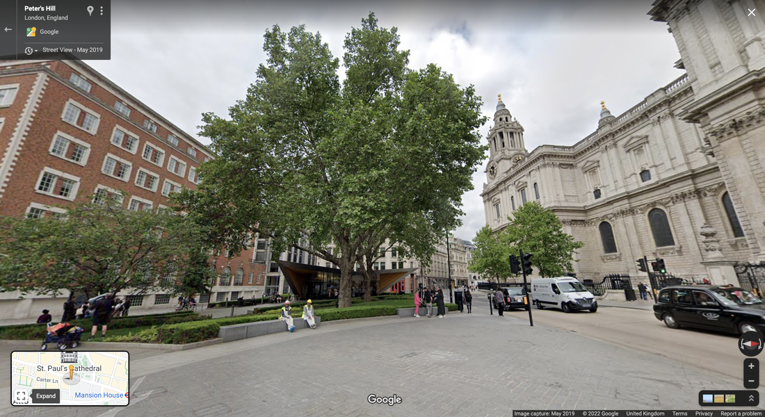
|
Shown in the screenshot on the left is the general area in which i would like to take the photographs for the piece as I like how the trees contrast against the urban setting of the Cathedral and I could use the sky as a template to add the ripple-like effects found in Vitturis work. I also see opportunity to change the colour of the big tree located in the center of the image via photoshop and strip the background of its colour to provide a contrast between the urban and natural elements of the image to portray the theme of nature and urbanisation colliding.
|

|

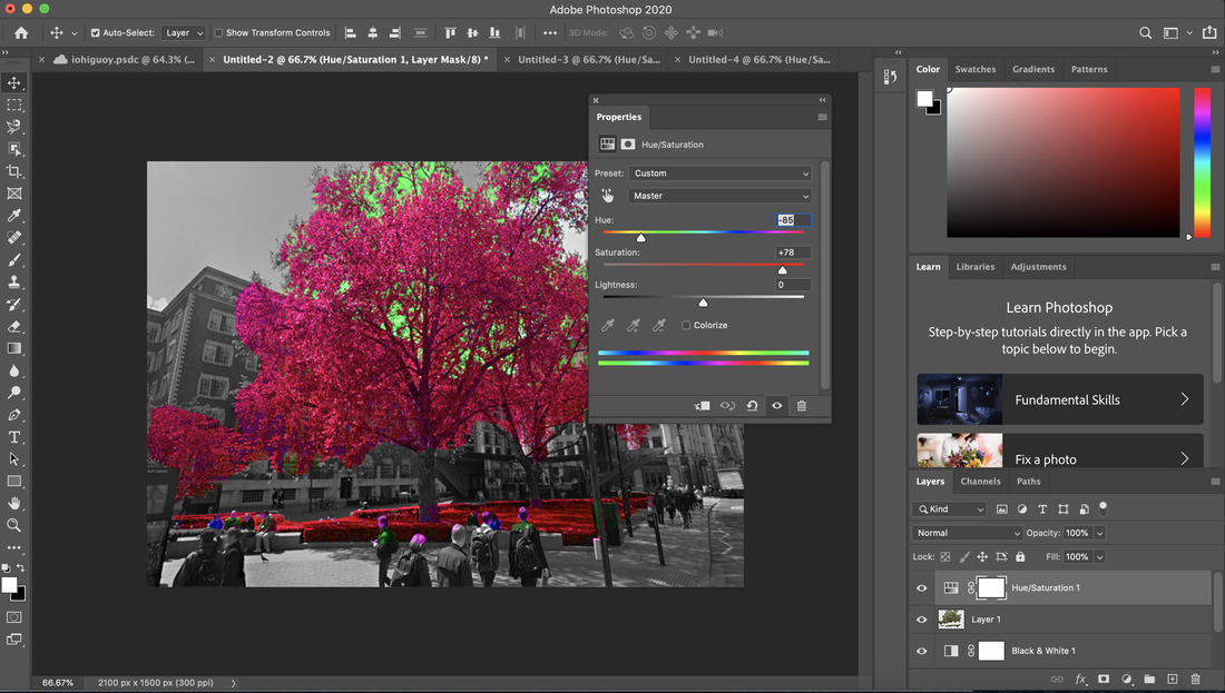
|
I really like how this response to Lorenzo Vitturi I produced during our making day turned out. I used Google Maps to screenshot an image from St Pauls Cathedral and used Adobe Photoshop to strip the colour from the surrounding landscape leaving only the natural elements such as; the bushes and leaves of the tree placed in the centre of the composition, I then selected the layer including the tree and underlying bushes and changed both the hue and saturation to a soaked red colouration leaving the contrast between the urban and natural subjects of the photograph amplified and displayed prominently through the black and white background underlying the saturated foreground. One thing I would change when producing pieces like this is spending more time separating the layers as the change in hue left some sections of the tree a fluorescent green colour due to me not taking the time to zoom in and cut out the small details of leaves inside the tree from the sky.
SUSTAINABLE PHOTOGRAPHY PROJECT
The Sustainable photography project is a project which aims to create other alternative ways to develop photographs which are eco-friendly and do not hurt the environment rather than traditional darkroom chemicals. Sustainable photography could decrease photography and art's waste produced and the overall impact on the environment as a whole. With climate change demonstrating it's effects visually in the last decade, now is the time to move away from these damaging chemicals used in photography and turn to a more environmentally friendly use of photographical production. Sustainable photography is easy to understand when taught and as the requirement for more sustainable photography increases like the use of chemigrams and other eco-friendly ways of producing photos will also increase and become more widespread over time.


I do not really like how these photographs turned out as they are quite bland and do not really have much depth, when creating these again I would add more prints of leaves, sticks and other items to create more detail and produced a far mot interesting photo to look at.
MAKING DAY 24.3.22
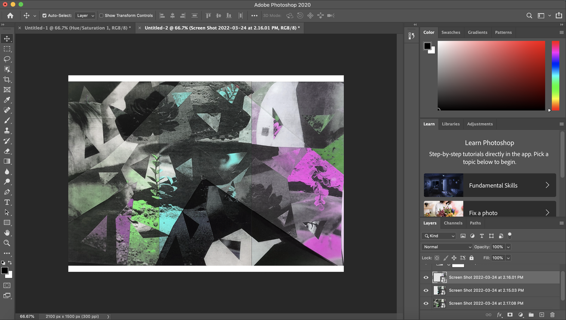
For one of my final pieces I would like to take inspiration from Lorenzo Vitturi in terms of processes and how the final product is produced, I'd like to start by gaining familiarity with his work through creating a geometric style collage with some of his photos from his project titled 'Anthropocene' in which he takes greyscale or neutral coloured images with a single object placed in a very simplistic composition edited to have their hue changed to produce something more unnatural and intriguing and create a supernatural and idiosyncratic effect which perplexes the viewer.
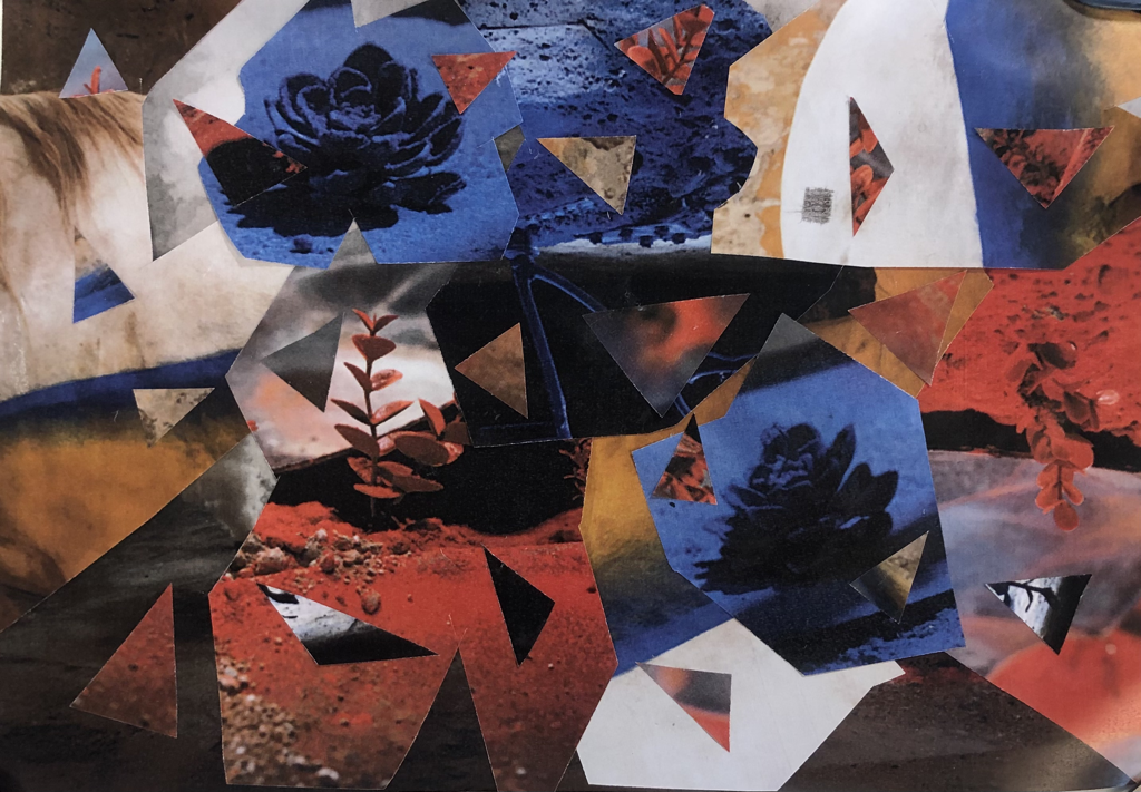
Creating this piece I simply cut around the most alluring and striking sections of 5 different images produced by Lorenzo Vitturi in a variety of different straight geometric and curved shapes and layered them based on what I found to be the most visually appealing and interesting to further develop. Additionally I cut out a number of small triangular pieces from different sections of Vitturi's work and placed them over sections of my collage in which contrasted the overlying colour to add detail and a sense of texture and depth to my collage which I think will look appealing.
'characterized by or decorated with regular lines and shapes,
- a geometric pattern.'
I thought it would be interesting to develop my collage by using the printer to modify the colour and change it into a single colour collage with both black and white complimenting shades alongside it, I decided to produce a blue, yellow and green version of this as I felt it would give me the most freedom in terms of experimentation however the colour in which I selected did not matter all too much as I could also modify it in photoshop if needed.


I felt that the best way to develop these 3 images further was to simply combine them, I cut straight and geometric lines at 3 random points of the collages at places where I think would create the most interesting edges and colour contrasts, I then placed and layered them accordingly to get a smooth transition from colour to colour whilst the lines and shapes of the image remained untouched.

I really like how this collage turned out as you can see clearly the points at which the colour changes, I also really like how you can see the shadow beneath the edges of the overlying pieces of paper since I had not glued them which I think creates a really nice appearance of natural depth within my collage. To develop this piece even further I decided to experiment with the colours of the collage further using Adobe photoshop, I simply experimented with the hue of the collage until I had 3 different combinations in which I was content with, I then printed them out.


Once I had 3 different collages in which I was happy with I then combined them. I used a ruler to measure the length of 1/3 of the collage and cut each collage evenly, I then layered them over each other accordingly and ended up with a final result,
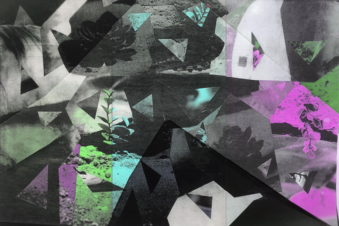
I am very happy with how this final piece turned out as there are a number of sections within the collage where the colour transitions into the next with both diagonal and vertical splits between the paper. I also really like how the features of Vitturi's original photograph are still visible within the collage e.g. the various different flowers and plants within the background. I feel that the collage has a very good amount of detail provided with the cut out triangles and shapes layered over the top of the original image.
I had a good amount of remaining time left and so I decided to start creating another piece of work, I felt that I would have a lot of freedom if I decided to use google maps as an instrument for creating my work as I could quite literally travel anywhere, despite this I decided to stay within London as this is what I was most familiar with and I felt I could find interesting subjects to take photographs of in a short amount of time.


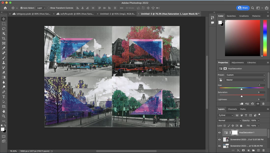
Once I had screenshotted 4 different photographs from Google Maps within Central London I decided to import them into photoshop, I wanted to continue along the theme of Lorenzo Vitturi's 'Anthropocene' project as I felt that I had a lot of freedom in using a similar process in creating a photographic pieces the way he does. I started by turning the image into a greyscale photograph, I then used the select tool to draw around the natural subject of the image, the tree, and used the hue/saturation slider to change the hue and saturation of the selected area to a deep red colour, I decided to try to match the saturation of colour in which Vitturi uses in his work. I then repeated this process with the 3 other photographs I had screenshotted with a variety of different colours in which contrast each other.


Overall I really like how these turned out, I am very content with how the extreme and saturated colours contrast heavily against the underlying background presenting the city as almost dead unlike the nature and rural elements found within it, I also like how in some of the photographs various other elements of the image were also selected such as pedestrian's heads and belongings were altered within Photoshop which was not something I intended on doing however I think it compliments the image very well creating other colours in which were layered over the black and white greyscale background.
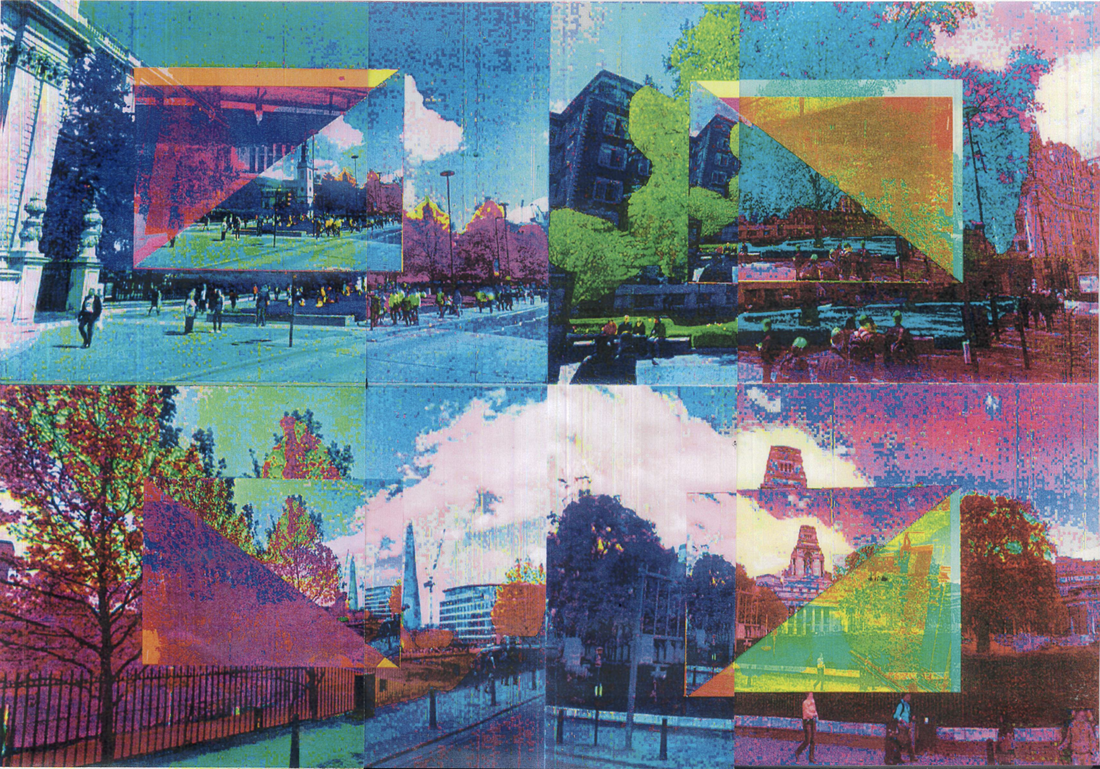
To develop this even further I decided to print each photograph in both an A4 and two smaller sizes, I then used the printer to convert one of the smaller photographs into a blue and magenta coloured set of photographs, once I had each of the newly coloured photographs I cut them in half diagonally into triangles and layered them over the default and unchanged photographs to create a single contrasting collage. With all the photographs I needed, I created 4 different collages in which consisted of all the same image however each one different in some way.


I really like how these turned out and the amount of contrast is presented within each photograph. I am very content with how the smaller photographs within the identical larger one are the same as it creates an almost see-through mirrored effect. I also really appreciate how there are various different types of contrasts within each image for example, the contrast between both the greyscale and coloured sections of the background images and the blue/magenta sections of the foreground images contrasting against the greyscale and darker coloured sections of itself. To develop the photographs further I imported each of the different collages I had made into photographs and placed each one into a corner of the rectangle.
I then experimented with different hues and saturations within photoshop and decided to produce these 3 abstract and almost boiled images, I decided to choose 3 colours in which were able to blend together well as green, blue and purple are all next to each other in the colour wheel.


I then decided to combine all 3 of the collages I had created by cutting each one into 3 sections, I then placed each one next to each other in a composition of transitioning order which creates a clear divide between each colour whilst still undergoing a smooth change between each colour.
Overall I like how this collage turned out as there are various different sections in terms of colour and photographs used. I really like how the saturation of the collage and the colours used are very loud and eye-catching, I think this creates quite an abstract setting regarding the collage with the components of the photographs themselves being recognisable but overshadowed by the loud and heavily saturated colours in which almost take over the main focus of the collage to a degree.
CANARY WHARF PHOTOGRAPHS
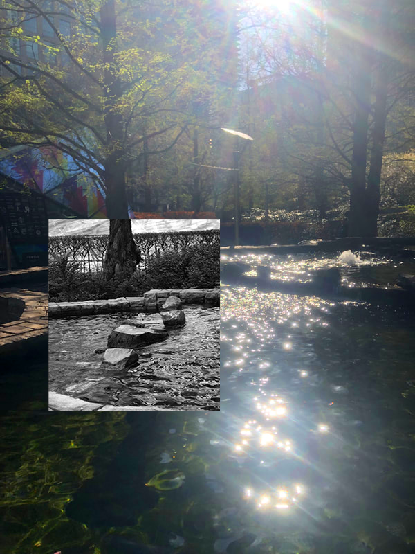
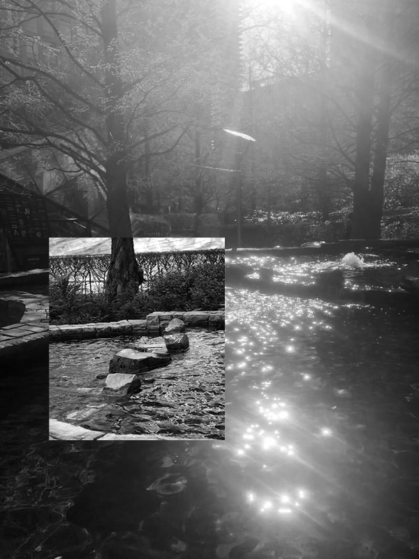
I was walking through Jubilee park next to Canary Wharf's underground station and found an interesting contrast between the park filled with water fountains, rocks, birds and trees and the modernised urban city in which surrounds it. I saw this as an opportunity to take a number photographs displaying the park using the sun as a natural light for a number of my photographs to create reflections within them.


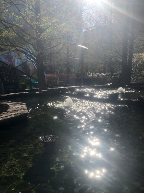
I was very happy with how a large majority of the photographs turned out however this photograph in particular I am very content with, I really like how the sun creates a number of intensely bright reflections in the water and produces lens flares against the camera creating this almost idyllic effect upon the water and the surrounding background including trees and the sun finding its way through the small gap between the two glass buildings.
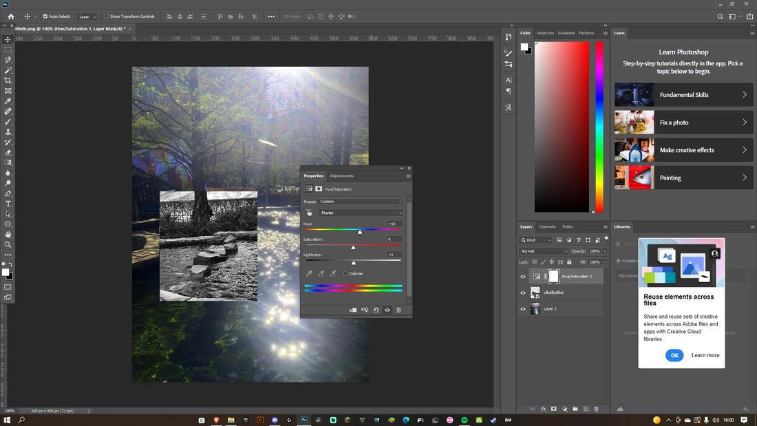
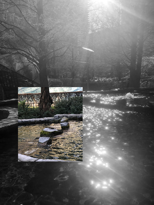
I decided to develop this photograph further by importing it into photoshop and layering another one of the various photographs I took over it, I lined up a tree found in the foreground image and a tree from the background image to create a transition and almost bridge between the two images. I then decided to experiment with the colours found within both images by converting some background and foreground images to greyscale leaving the layered over or underlying photograph to contrast or blend in within the other photograph.
|
|
|
I Really like how these 3 collages turned out as both photographs themselves almost blend in which each other perfectly however contrast in terms of the colour and greyscale properties in each of them. I also really appreciate the simplicity of the collages themselves as the square outline of the foreground photograph contrasts against the rest of the image whilst still transitioning into it through the position of the photograph within the composition of the collage and the tree acting as a bridge from image to image.
ST PAUL'S FOUNTAIN COLLAGE
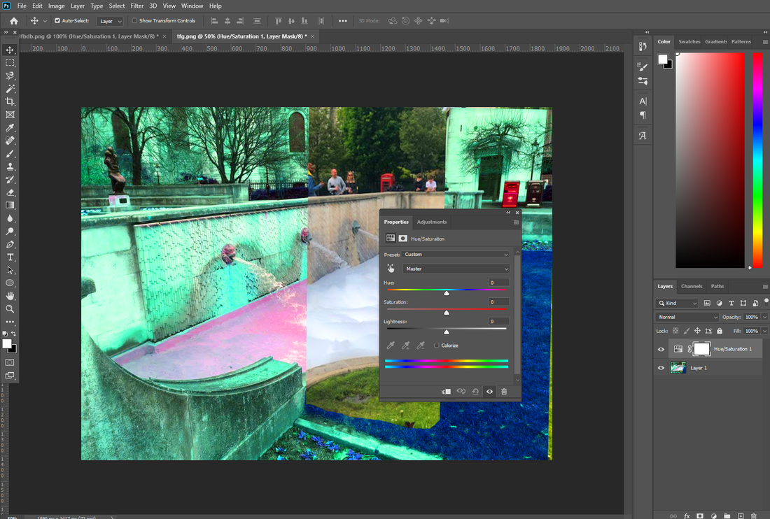
At Festival Gardens in St Paul's Cathedral, Fairy liquid was used to create bubbles in the fountain, I took a photograph and thought nothing of it, however I had a photograph of the fountain from a different day and thought I could create an interesting collage between the two photographs as they are both taken at the same position however contain very obvious differences such as the season and and bubbles within the fountain.


I used Adobe Photoshop to create a collage between both images, I started by using the select tool to cut out a small section of the overlying photograph (the fountain containing the bubbles), I then positioned this over the background image and lined it up perfectly so they transitioned between each other despite their differences. I then decided to change the hue of the underlying image to create a contrast between the layered foreground photograph and the background image.
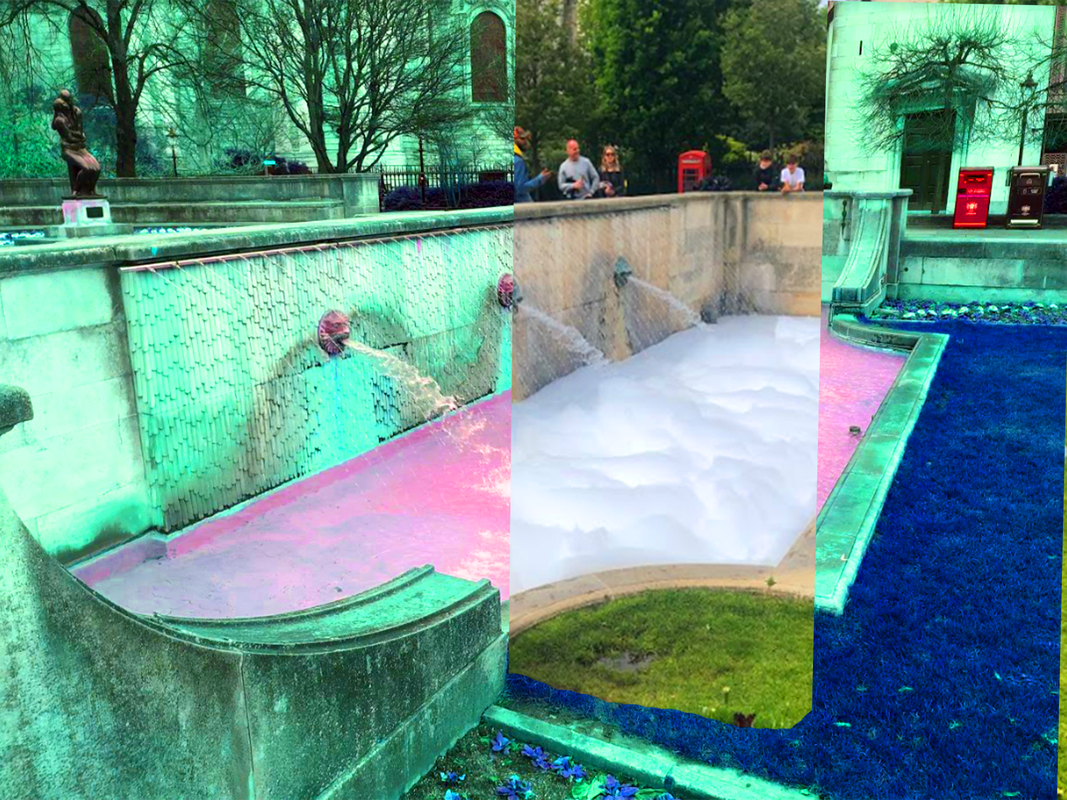
I really like how this collage turned out as there is a clear contrast between the two photographs however they blend in together perfectly due to them being the same image, I also really like how the colours selected in the background image contrast against the white bubbles in the water of the foreground image. One thing I would change if I were to re-do this piece would be to cut out the rest of the green area on the modified coloured grass as I feel it would make it appear less choppy and provided a smoother transition between the two images.
HAND PORTRAIT
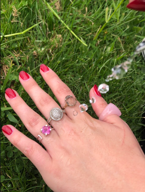
I took this photograph of my friend's hand laying on the grass whilst droplets of water were being poured onto it. The photograph was taken at a time where the droplets of water were mid air at the time in which it was taken, I think this creates a cool effect with the water almost looking like pieces of glass or diamonds which adds a nice detail to the photograph. The outline of the hand against the grass could be used well when developing the image providing a clear contrast which could be supported with various other colours to create an interesting photograph.
I started to develop the photograph by importing it into Adobe Photoshop and experimenting with various different layering effects provided such as, gradients, inverting colours and positive and negative foreground and background spaces.
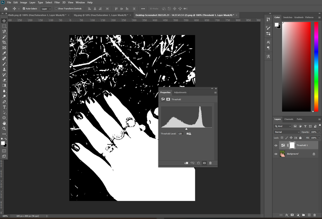
I ended up with a large variety of photographs however I was mostly interested in further developing the blue gradients in which ranged from a very light and almost white soft blue to a deep dark purple-like blue. I felt it would be interesting to create a piece of work which implemented different shades of the same colour to transition from light to dark whilst using the same original photograph.


To begin with I decided to choose 4 different shades out of the 33 different in which I felt I could neatly transition between each other from light to dark, I then used the select tool to equally cut each of the images evenly, I then layered them over each other to create a transition from light blue to dark blue making sure the photograph remained the same.

I really like how this piece turned out as there is a clear contrast between the straight lines in which separate each transitioning shade and the natural and less geometric subject photograph. I also really like how the photograph is still clearly visible however there are layers within it based on the different shades of images placed in a composition to form themselves. To further develop this piece I decided to simply experiment with different colours and produce multiples outcomes within photoshop and I am very content with how these came out.


