
MAKE DO & MEND

|
School has changed. The current Covid-19 situation has effected learning and school drastically and we are having to adapt to the new guidelines and rules swiftly, for example we are unable to get guidance as often and are often finding ourselves having to do most work online, we have started a new fresh topic at the start of year 10, Make Do & Mend. Making is the art of creation and mending is where you develop, fix and or repair something, this falls into photography because you can change, develop and edit photos using media and technology in the present and industrialised world. 'Make do & Mend' arose in the 1930's when soldiers involved in the Second World War were required to 'Make do & Mend' of their materials. This holds similarity to a lot of projects we work on in photography as we are often making use of the space and resources provided and creating something new out of something old.
Furthermore once you have constructed your project you can photograph it different angles, distances and against different background to give the project a more interesting look even after when it's constructed whilst using photography in itself. |
|
|
|
MARCEL DUCHAMP AND THE READYMADE

|
|
|
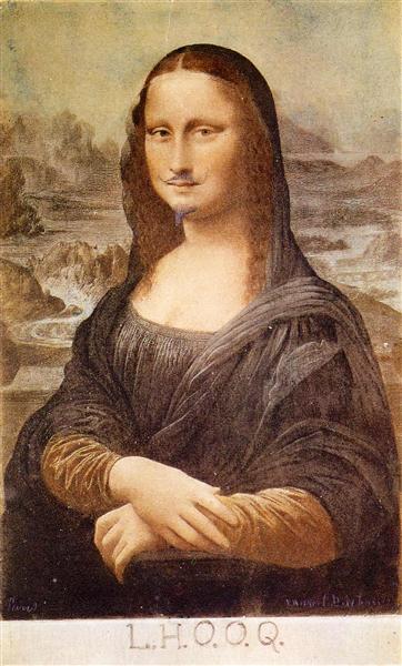
leonardo da vinci, 'mona lisa', 1503
|
marcel duchamp 'L.H.O.O.Q' 1919
|
The 'Mona Lisa' by Leonardo DaVinci is painting apart of renaissance art of a women who is theorised to be Lisa Del Giocondo, an Italian noblewoman and member of the Gherardini family of Florence and Tuscany. however is also theorised to be a self portrait of Leonardo da Vinci as the smile is strangely similar. The Mona Lisa is famous due to the use of illusion creating a unique smile through perspective and by using shadow work. Da Vinci painted Mona Lisa in such a way that the eyes are the center of the viewer's attention and the mouth is the periphery. It was also stolen in 1911 by a man named Vincenzo Peruggia however was returned in 1913 to the Louvre Museum in Paris, France where it sits today.
Duchamp's 'L.H.O.O.Q'
The name of the piece, L.H.O.O.Q. is a joke to ridicule or make fun of The Mona Lisa, when pronounced in French it sounds like ''Elle a chaud au cul'' which translates to a vulgar french saying as a way to almost mock the original 'Mona Lisa'. In the reproduction of The Mona Lisa, Duchamp has added a moustache and made the painting a much more sketch-like texture for a humorous effect. The L.H.O.O.Q is a readymade piece because he used a famous painting that has already been produced and added his own touch for a new piece of art. This was revolutionary because it inspired many artists to do the same and start experimenting with similar ideas which sparked a new type of art.
The name of the piece, L.H.O.O.Q. is a joke to ridicule or make fun of The Mona Lisa, when pronounced in French it sounds like ''Elle a chaud au cul'' which translates to a vulgar french saying as a way to almost mock the original 'Mona Lisa'. In the reproduction of The Mona Lisa, Duchamp has added a moustache and made the painting a much more sketch-like texture for a humorous effect. The L.H.O.O.Q is a readymade piece because he used a famous painting that has already been produced and added his own touch for a new piece of art. This was revolutionary because it inspired many artists to do the same and start experimenting with similar ideas which sparked a new type of art.
DEBORAH ROBERTS
Deborah Roberts is an American contemporary artist who produces collages from photographs which project concepts based upon identity, race and gender politics. All of her metaphorical pieces include a blank, white background with the subject of the image consisting of children placed into a composition of various different pieces of clothing, colours, patterns and body parts constructed together to create a distorted and altered perception of the various different sections of the collage produced. The colours selected in the foreground of the piece contrast against the underlying background in which compliments the subject effectively, I also think this gives the image a deeper meaning as the empty background provides the main focus of the collage with importance and could symbolise various other ideas in which Roberts chooses to explore throughout her work.


DEBORAH ROBERTS RESPONSE

|
|

|
Prior to cutting and altering the photographs I was going to use in my collage I decided to pick out a range of photographs in which matched the theme of Deborah Robert's work including coloured pieces of clothing and distorted facial features such as this orange dress and photograph of a man with enlarged and modified features, I decided to arrange them in a composition similar to a lot of other Deborah Robert's pieces where the underlying photograph of the person appears to be wearing the piece of clothing in an almost comical manner which seems to be a recurring theme throughout her work. I chose to use a photograph of an old letter as the background for my collage as I wanted to alter one key element of Deborah Robert's work, I think the background I chose to apply to my piece created an almost vintage feel like it was something out of a scrapbook with the obvious tearing of the white paper in the foreground being visible in which I think adds depth and personality to the collage. Overall I really like how this piece turned out as It has a lot of layers and detail within it and the colours are vibrant but also carry that vintage-like ambience.
|
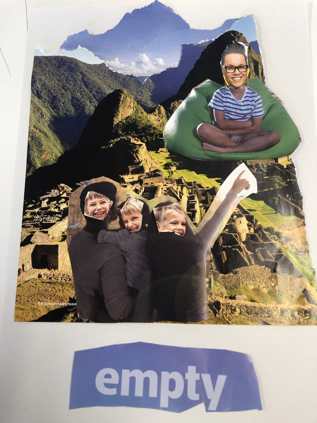
SCHOOL BAG COLLAGE
Make do & mend consists of manufacturing photographic pieces out of the components available and so as a class we decided to empty out the contents of our school bags and photograph them in as many interesting compositions as possible. It was somewhat challenging to create interesting compositions out of the random items in my school bag and I felt somewhat limited with the options I had and so I found that layering items on top of each other was the easiest way to add depth and appeal.


KENSUKE KOIKE
Kensuke Koike is a Japanese contemporary visual artist who takes already existing photographic material and distorts them using various geometric two-dimensional and three-dimensional shapes, I find his work interesting because


Kensuke Koike Response -
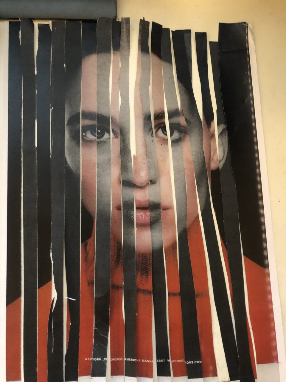
In response to Kensuke Koike I used an app on my phone called 'Stop Motion Studio' to document my work in which I cut an image into strips over a coloured background and created an animated stop motion video.


WWW:I think I did well with the stop motion video and using inspiration from Kensuke Koike. This was my first time using the app so therefore the first time using this media.
|
EBI:I think I could've spent more time and effort on making a more interesting reconstruction rather than the video, I could also try making neater and cleaner cut when creating my work.
|
Image Analysis + Response -
Original Image -
|
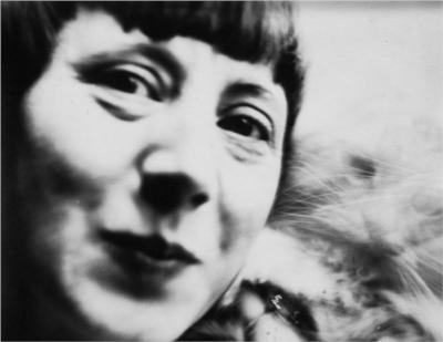
I think the image is representing the contrast between the man and the rest of the crowd, he may be different or have something different about him compared to everybody else.
If I could interview the person in the image I would ask how he is feeling as it is not clear judging by his facial expression and body language. The background contributes to the narrative because it is a train station, train stations are often loud, busy and sometimes hectic which directly contrasts with the character in the image. The image is in black and white which also supports the dullness and neutralness of the mans expression. The Image contains a crowd of people behind barriers in what seems to be in a cramped and tight space within what looks to be a train station. everyone in the image seems to have some form of mood, emotion and or character, however the main focus is the man on the right with his eyes on the camera. He is not in the centre or symetrical to the image like most pieces of photography but is the main focus because he is clearly not fitting in the atmosphere as he holds a different character contrasting to everybody else. This creates a sense of eeriness. |

|
Response -
I changed and altered the image with another to create a different picture. It is interesting to see how the coloured foreground contrasts with the neutral background and distracts from what the original image is conveying.


Hannah Höch -
|
Hannah Höch was a German Dada artist born in Gotha, Germany in 1889 who made collages based on female representation.
|


Hannah Höch Response -
Jean Faucheur -
Jean Faucheur was an artist born in Versailles, France in 1956 who takes ordinary looking images and alters them to create distortions within them. He explores all types of art including sculpting, painting & Photography.
Here are some examples of her work -


Jean Faucheur Response -
WWW: Nice contrast between shades and colour.
|
EBI: Make cleaner cuts.
|
Hannah Höch compared to Jean Faucher (Responses)

|
|
When comparing both my responses, The Hannah Höch inspired response appears considerably more colourful and bright maybe because they are from a magazine in which it's purpose is to catch the audience's attention in contrast to The Jean Faucheur response with less saturated colours.
In terms of confusing and manipulation of images I think the Hannah Höch response is much more confusing and contains more variety in images used compared to the Jean Faucheur response which contains only one change in which half of the image is greyscaled in strips.
Comparing the two artists however,

|

|
Hannah Höch's art seems to be more collaged whereas Jean Faucheur's look as though more modern and manipulated rather than made up of multiple images which can also be spotted within the responses. However in this case Jean Faucher's image looks more confusing due to her more complicated manipulation of the image and gives a sense of eeriness due to the image seeming recognisable but not able to be comprehended.
|
Maurizio Anzeri -
Maurizio Anzeri is a Photography and Artist born in Loana, Italy in 1969 who creates art by sewing into vintage photos with aims to represent a feeling or mood in the people within the images.
Here are some examples of his work -
Here are some examples of his work -


Maurizio Anzeri Response -

|
WWW: Bright colours stood out among the greyscale image, the use of circles as anchor points gave for an interesting pattern
EBI: Use of different contrasting colours, more variety in pattern and shapes. |
Matt Lipps -
Matt Lipps is a an American artist and photography born in Oakland, California, 1975.
He creates pieces of art by standing images up and creating depth, contrast and shadows, here are some examples -
He creates pieces of art by standing images up and creating depth, contrast and shadows, here are some examples -


Matt Lipps Response
|
|
WWW: Black background made images stand out rather than a white table top
EBI: Choose more contrasting coloured images, more images, use shadows in a more interesting way, try experimenting with depth and take pictures with a more head-on angle. |

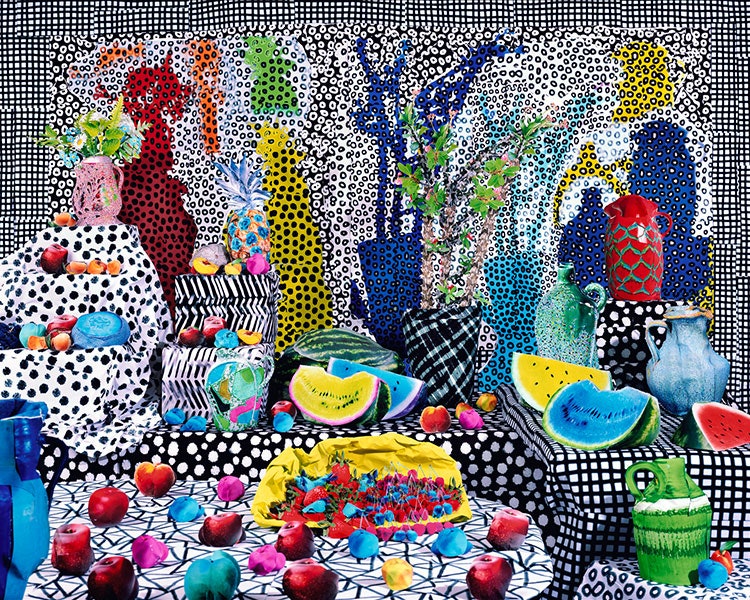
Daniel Gordon
Daniel Gordon is an American artist born in Boston, Massachusetts, 1980 who creates largely coloured with aspects of both collage and set-up photography His work, as described by The New York Times, "Involves creating figurative tableaus from cut paper and cut-out images that Mr. Gordon then photographs. In addition, he seems motivated by a deeply felt obsession with the human body and the discomforts of having one."


Image Analysis -
|
In this image there are lots of brightly coloured fruits, vases and what seems to be furniture. A lot of different colours are used in which they contrast really well especially with the grey backgrounded images on the coloured fruits and other objects.
It is very hard to tell how he creates his artwork but I would make the conclusion that he either uses very brightly painted props and places them other props and backgrounds or places fairly usual coloured props in front of these backgrounds and then colour-grades them in some sort of editing software. The artist is using lots of contrast, composition, and has some forms of ambiguity. |


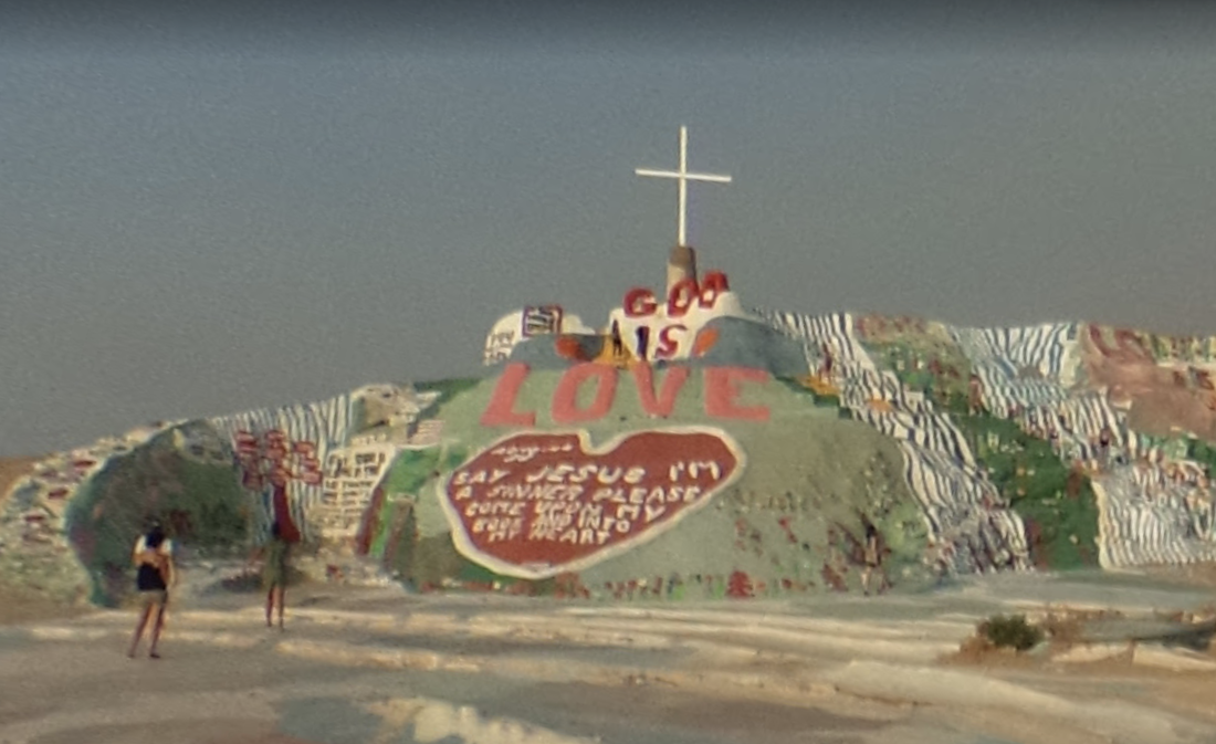
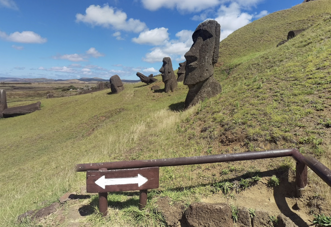
Google Maps Photography


Personal Project - Unique Places on Google Maps.
|
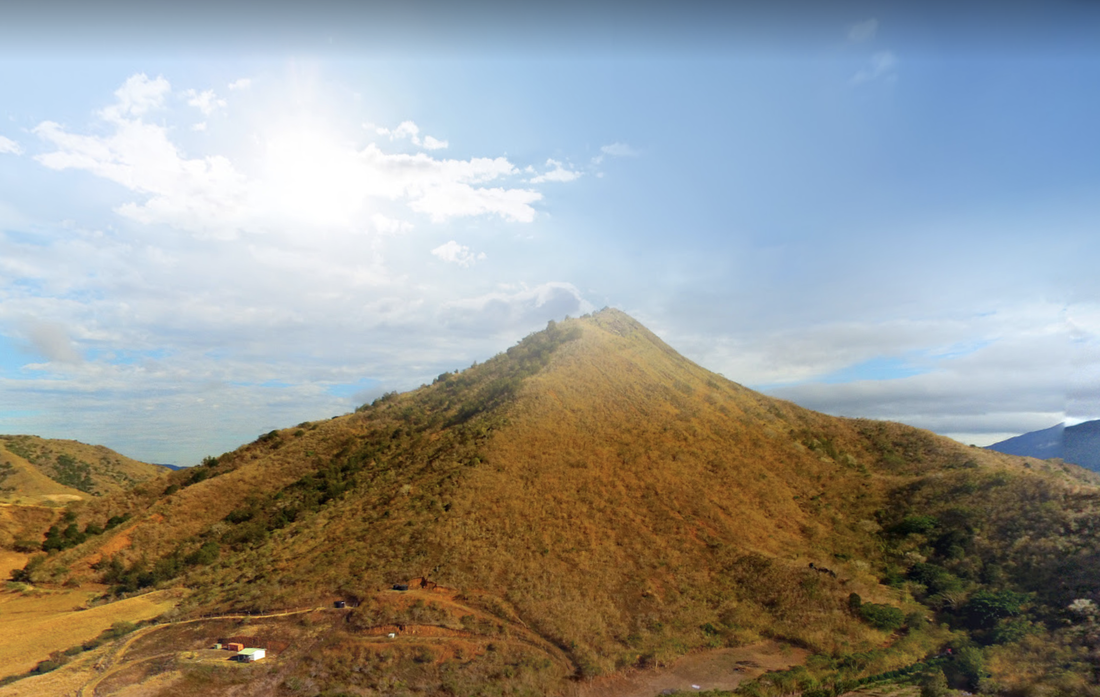
I decided to start looking and i managed to find this brightly painted mountain, it is located in California in a city called 'Slab City'. The weather creates a mysterious and eery atmosphere which I found very interesting.
|
This image appealed to me because i thought it looked nice how there is a clear boundary between the sky and the grass with the addition of the row of tents laid across the ground.
|
|
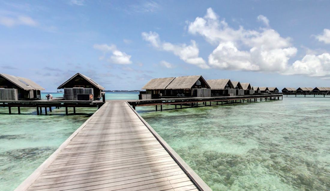
This picture looked very nice because the sea was a perfect teal colour paired with the sky and a row of huts along the beach.
|
|
|
|
I like how the sun glares over the mountain
|
|

Google Maps Safari


I took these images in Hawaii because i knew that it was very tropical and I like the saturated light blue colour of the ocean within tropical countries as i think it looks really good in photo's.


